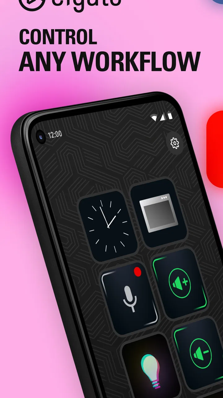
Elgato Stream Deck Mobile
- 4.7
- Rating
- 1.00M
- Installs
- Free
- Price

 Analysis by App-foxy
The first time I used Elgato Stream Deck Mobile, I understood the appeal almost immediately: it turns a phone or tablet into a customizable control surface for tasks that normally require several clicks, keyboard shortcuts, or a trip through a menu. That sounds simple, but the difference becomes noticeable when the same actions appear in my day repeatedly. Opening work tools, controlling a live setup, launching a routine, or keeping frequently used commands within reach can all feel more direct.
This is a productivity app from Corsair Memory, Inc., and its purpose is much narrower than that of a general task manager or note-taking tool. It is best viewed as a companion for workflows that already contain repeatable actions. The free download makes it easy to try, while optional in-app purchases range from $2.99 to $49.99 per item. I would not install it expecting a complete productivity system; I would install it because I want a configurable panel of controls that matches the way I already work.
Does the convenience survive beyond the first week?
During the first week, the strongest impression is the feeling of turning a familiar phone into something more purposeful. Instead of opening an app, finding a command, and repeating that path every time, I can arrange controls around the actions I use most. The value is especially clear when the same small sequence happens many times in one day. A button that removes several taps may seem insignificant once, but the saved attention matters when repeated across a full work session.
You May Also Like

 Blood Strike: 2.5 Anniversary
Blood Strike’s Loadouts Turn Every Drop Into a Tactical Gamble
A close look at Blood Strike’s custom loadouts: how fast access to signature weapons reshapes its battle royale rhythm, rewards preparation, and narrows the gap between fights.

 Pandora - Music & Podcasts
Pandora’s Music Is Easy to Start, but Harder to Recover
Pandora’s strength is its low-effort path from a seed to a station. Its weak spot is how much confidence it asks you to place in connection, setup, and quiet recovery.

 8 Ball Pool
 Is Built on Rivalries, Rematches, and Routine
A close look at the rivalries, rematches, shared routines, and unanswered safety questions that turn a quick pool match into a persistent mobile community.

 Samsung Music
’s Quiet Strength Is Playing What You Already Own
Its reach comes less from spectacle than from dependable access to a personal library. That simplicity is both the app’s strongest retention engine and its ceiling.

 AccuWeather: Weather Radar
AccuWeather Review: A Quick, Clear Forecast for Everyday Decisions
For everyday plans, the best forecast is the one you can understand quickly. AccuWeather makes rain timing, radar, and local conditions easy to act on, with a few trade-offs.

 Hill Climb Racing
Why Hill Climb Racing Still Turns Crashes Into One More Run
A tiny car, a bumpy hill and one more upgrade: Hill Climb Racing keeps resurfacing because its simple chaos makes every near-miss feel personal.
More From Our News Desk



The app’s store summary describes it as a way to control any workflow from a phone or tablet, and that broad idea is more useful than it first appears. I can think of it as a layer between me and the software I use. The phone is no longer only a screen for consuming information; it becomes a dedicated set of shortcuts. That makes the experience feel closer to using a physical control panel, although the result still depends on how carefully I organize it.
One practical strength is the ability to design the layout around context rather than around the names of applications. I might want one group of controls for a morning routine, another for focused writing, and another for a streaming or presentation session. This is more flexible than keeping a long list of shortcuts in a notebook or relying on memory. The key is to build arrangements that reflect real moments in the day, not simply collect every possible command because it is available.
A realistic example is a remote work morning. I can keep a small set of actions together for starting the day: opening the tools I need, reaching a recurring workspace, and triggering commands that would otherwise be scattered across different windows. Later, I can switch to a meeting or presentation-oriented arrangement instead of searching through the same controls again. The benefit is not dramatic automation by itself; it is reducing the number of tiny decisions that interrupt my attention.
That first-week appeal can also become a trap. Customization is enjoyable, and it is easy to spend more time arranging buttons than using them. I recommend starting with only the actions I perform often and leaving the rest alone. A compact layout with obvious labels is usually more useful than a crowded panel full of commands I might need someday. The app rewards restraint as much as experimentation.
Where it fits better than ordinary shortcuts
Compared with standard keyboard shortcuts, the mobile control panel is easier to see. I do not have to remember a combination of keys or worry about whether a shortcut conflicts with another application. That makes it attractive for actions I use often but not often enough to memorize. It can also be more approachable for someone who prefers visible controls over hidden commands.
Compared with a regular launcher, it offers a more intentional arrangement. A launcher is generally designed to open apps, while this tool is useful when I want a surface organized around a workflow. Compared with a task list, it does not tell me what needs doing; it helps me perform the actions I have already decided to repeat. Those distinctions matter. If my main problem is planning, reminders, or storing information, another productivity app will probably serve me better.
The first-week experience is also shaped by the device itself. A phone is convenient because it is usually nearby, but it is not always the ideal permanent control surface. I have to wake the screen, hold the device, and look down. A tablet offers more room and may feel more comfortable for a larger arrangement, while a phone is better for quick access. The right choice depends on whether I value portability or a spacious, glanceable layout.
What creates recurring value month after month
After the novelty fades, the app earns its place only if it becomes part of a habit. In my experience, that happens when a control is tied to a repeated moment rather than treated as a collection of clever tricks. A button that helps me start a familiar workflow each morning has lasting value. A button created only to demonstrate customization may be forgotten within days.
The most durable use cases are workflows with a stable sequence and occasional variation. Streaming is an obvious example because creators often need quick access to recurring controls while keeping their attention elsewhere. Presentations, audio work, remote meetings, and repeated office routines can benefit for the same reason. The app is strongest when my hands are busy, my focus is elsewhere, or the command is annoying to reach through normal menus.
There is also a useful psychological advantage to a dedicated layout: it makes a workflow visible. When I see a small group of controls arranged for a specific purpose, I am less likely to improvise a slower route. This can help me move from setup to execution more quickly. It does not replace discipline, but it can make a good routine easier to repeat.
A less obvious benefit is using the app as a boundary between work modes. I can reserve one arrangement for writing and another for live activity, which helps reduce the temptation to mix every command into one screen. The value comes from separation. When everything is placed together, the control panel becomes a crowded toolbox; when each arrangement has a clear role, it becomes a visual cue for what I am doing now.
I would also treat the app as a place for high-frequency actions, not as a warehouse for every available option. If a command is used once a month, it probably does not deserve a prominent position. If I use a command several times in a session and routinely forget its shortcut, it is a much better candidate. This simple test keeps the layout connected to actual behavior.
The app has a strong public signal behind it: it holds a 4.7 average from around 9.1 thousand ratings, with more than a million installs. Those figures suggest that the concept is resonating with a substantial audience, but they do not remove the need to judge personal fit. A high rating cannot make a repetitive workflow appear automatically. The recurring value still depends on whether I have enough repeatable actions to justify a dedicated control layer.
The cost of keeping a useful layout
Maintenance is the part that determines whether the app remains useful. A layout can start out perfectly and become confusing as my work changes. Applications move commands, projects end, new routines appear, and old shortcuts lose their purpose. If I never review the panel, I eventually press buttons out of habit rather than confidence.
I find a short review more effective than a major redesign. When a control stops being useful, I remove it instead of pushing it into an increasingly crowded arrangement. I also prefer names that describe the result of an action rather than the technical command behind it. “Start meeting setup” is easier to understand at a glance than a label that only makes sense when I remember how it was configured.
Grouping is another important maintenance decision. I would keep controls that belong to the same moment together, even if they affect different applications. That is more natural than organizing everything by software name when my real workflow crosses several tools. At the same time, I would avoid creating too many groups. Excessive separation forces me to search for the right page, which defeats the purpose of quick access.
There is a trade-off between customization and stability. A highly personalized layout can be faster for me than a default arrangement, but it also requires me to remember what I changed. If I share a workspace or switch devices, that personal logic may not be obvious. For this reason, I recommend keeping the first layout conservative and changing it only after a real friction point appears.
Version 2.1.2 is the current version, and the app is intended for operating system version 9 or later. That broad compatibility makes it approachable for many users, but I would still think about the practical condition of my device. A phone with a small screen, frequent lockouts, or an awkward position on the desk may make the experience less comfortable than the software itself suggests. The app cannot solve a poor physical setup.
What causes fatigue over time
The first source of fatigue is screen dependence. A physical control surface offers tactile feedback, while a phone gives me a flat display that I must look at. For occasional commands, that is fine. During a long session, repeatedly checking the screen can become distracting. Anyone who needs blind operation or extremely fast muscle memory may prefer dedicated hardware instead.
The second source is configuration drift. The more customized the layout becomes, the more noticeable every outdated control feels. A button that no longer behaves as expected damages trust in the whole panel. I would rather have a smaller collection of dependable actions than a visually impressive arrangement that requires constant explanation.
The third is the temptation to turn every task into a button. Not every action benefits from being automated or surfaced. Sometimes a normal menu is clearer, especially for rare tasks where I need to confirm what I am doing. The app works best as a shortcut layer, not as a replacement for understanding the software underneath.
There is also a financial consideration. The app is free to download, but optional purchases are available, with individual items priced from $2.99 to $49.99. I would begin with the free experience and judge whether the workflow improvement is real before spending anything. The higher end of that range makes sense only for someone who already knows that this style of control fits their routine and will be used regularly.
The Everyone content rating makes the app broadly suitable from an age-classification perspective, but suitability is not the same as usefulness. A student who mainly needs notes and reminders may gain little from it. A professional who repeats the same setup actions every day may gain much more. The app’s audience is defined by workflow repetition, not by age or job title.
Who should keep it installed?
I would recommend it to people who already have a repeatable digital routine and feel that small interface steps are slowing them down. Streamers, presenters, creators, and users who move between several tools are natural candidates. It can also suit someone who dislikes memorizing keyboard shortcuts but still wants quick access to frequently used commands.
I would be more cautious for users seeking an all-in-one productivity manager. This is not where I would go first for calendars, project planning, long-form notes, habit tracking, or document storage. It can support those activities indirectly by making related actions easier to reach, but it does not replace the apps that actually hold the information.
I would also skip it if I rarely repeat the same digital actions. In that situation, the setup work may outweigh the convenience. A normal launcher, a few pinned tools, or built-in shortcuts may be simpler and easier to maintain. The best alternative is often the one that introduces the least extra surface between me and the task.
For users deciding between this and dedicated hardware, I see the mobile version as the lower-commitment option. A phone or tablet is flexible and already familiar, but it lacks the physical certainty of a purpose-built controller. If I need constant tactile access during live work, hardware may be the better long-term investment. If I want to test the idea, travel with it, or avoid adding another device to my desk, the mobile approach is more practical.
My final judgment is that the app can earn lasting space, but only when I use it deliberately. Its first-week appeal comes from customization; its month-to-month value comes from removing repeated friction. The difference between those two stages is important. A panel filled with novelty controls will fade. A small, well-maintained set of actions connected to real habits can remain useful for a long time.
In my own recommendation, I would start with one workflow, build only the controls I use repeatedly, and live with that arrangement before expanding it. I would review it whenever my routine changes and remove anything that no longer saves attention. That approach keeps the app from becoming another system to manage.
Elgato Stream Deck Mobile is a free productivity app with optional purchases, developed by Corsair Memory, Inc., and released on March 9, 2020. Its broad appeal is understandable, but its real test is personal: do I have enough recurring actions to justify a dedicated control panel? If the answer is yes, it can turn a phone or tablet into a genuinely useful companion. If the answer is no, the usual shortcuts and launchers will probably remain simpler, faster, and easier to live with.
FAQs for Elgato Stream Deck Mobile
01What is Elgato Stream Deck Mobile and what can I use it for?
Elgato Stream Deck Mobile turns your iPhone or Android device into a customizable control panel for streaming, content creation, productivity, and other shortcuts. After connecting it to the Stream Deck desktop application, you can create virtual buttons for actions such as starting a live stream, switching scenes, muting a microphone, launching programs, controlling media, or opening websites. It is especially useful when you want quick access to commands without memorizing keyboard shortcuts.
02Does Elgato Stream Deck Mobile work with both Android and iOS devices?
Yes, Elgato Stream Deck Mobile is designed for compatible Android and iOS smartphones and tablets, although exact operating-system requirements may change over time. You also need the Stream Deck desktop software installed on a compatible Windows or macOS computer. The mobile device and computer generally need to communicate over the same local network, so a stable Wi-Fi connection and updated software are important for reliable performance.
03Is Elgato Stream Deck Mobile free to use, or does it require a subscription?
Elgato Stream Deck Mobile has traditionally offered a limited free experience alongside premium features that may require a subscription or in-app purchase, depending on the current version and platform. Premium access can unlock more buttons, profiles, customization options, and advanced functionality. Before downloading, check the official store listing for the latest pricing, trial conditions, and included features, since plans and availability can change.
04How do I connect Stream Deck Mobile to my computer?
To set up Stream Deck Mobile, install the official Stream Deck desktop application on your Windows PC or Mac, then install the mobile app on your phone or tablet. Open both applications while they are connected to the same Wi-Fi network and follow the pairing instructions shown on screen. Once linked, you can assign actions from the desktop software and organize them into pages or profiles on your mobile device.
05What should I do if Stream Deck Mobile disconnects or the buttons stop responding?
If the app loses connection, first confirm that your phone and computer are using the same Wi-Fi network and that neither device is blocking local network communication. Restarting the mobile app, Stream Deck desktop software, and router can often resolve temporary problems. Also check for application updates, disable restrictive VPN or firewall settings temporarily, and keep the devices awake during use. Persistent issues may require consulting Elgato support or network settings.
Pros
- Turns your iPhone or Android phone into a customizable control panel.
- Supports multi-action shortcuts for launching several commands at once.
- Profiles can change automatically for different apps
- games
- or workflows.
- Useful integrations with streaming
- music
- smart home
- and productivity tools.
- Cloud-based setup makes it easier to keep layouts consistent across devices.
Cons
- Many advanced features require a paid subscription after the trial period.
- Your phone must stay unlocked and connected for reliable button access.
- Wireless connections may introduce occasional delays or disconnections.
- Small screens can feel cramped when using complex layouts with many buttons.
- Some integrations require extra software or configuration on the computer.

Elgato Stream Deck Mobile
Gallery